- Back to Home »
- Android goes keto with a radical new rebrand
Posted by : Brij Bhushan
Thursday, 22 August 2019

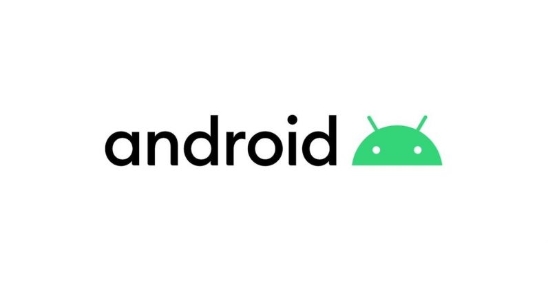
Android’s ditching the carbs and saying farewell to sugar. The latest update to the brand, unveiled today by Google, introduces a new logo and style language, and ditches the iconic dessert-themed OS codenames. So, let’s talk about the logo. The old-school “bugdroid” robot has had a bit of surgery and now only shows its head, rather than the entire body and the requisite appendages. Similarly, the Android wordmark is slightly more svelte. As with the previous two revisions, each character is lowercase. However, when examining the new logo, you’ll notice that each character has been thinned somewhat, and there’s now…
This story continues at The Next Web
Or just read more coverage about: Android


